Initially in the ideas stage I was racked with a dislike of the messaging that sustainable systems pushes. This led me into deeper thought on the messaging of the environmental movements as a whole and how negative reinforcement is used to scare people away. The problem I faced is that people already are scared—now we just have to motivate them to fix it. Seminar had me look into academic sources and studies to come to a conclusion backed by science and data. Many theses were written discussing and studying the impacts of language shifts and how well diverse groups of people would respond in terms of climate change. The phenomena discussed earlier is referenced heavily, showing the disparaging gap in climate knowledge and willingness to take action.
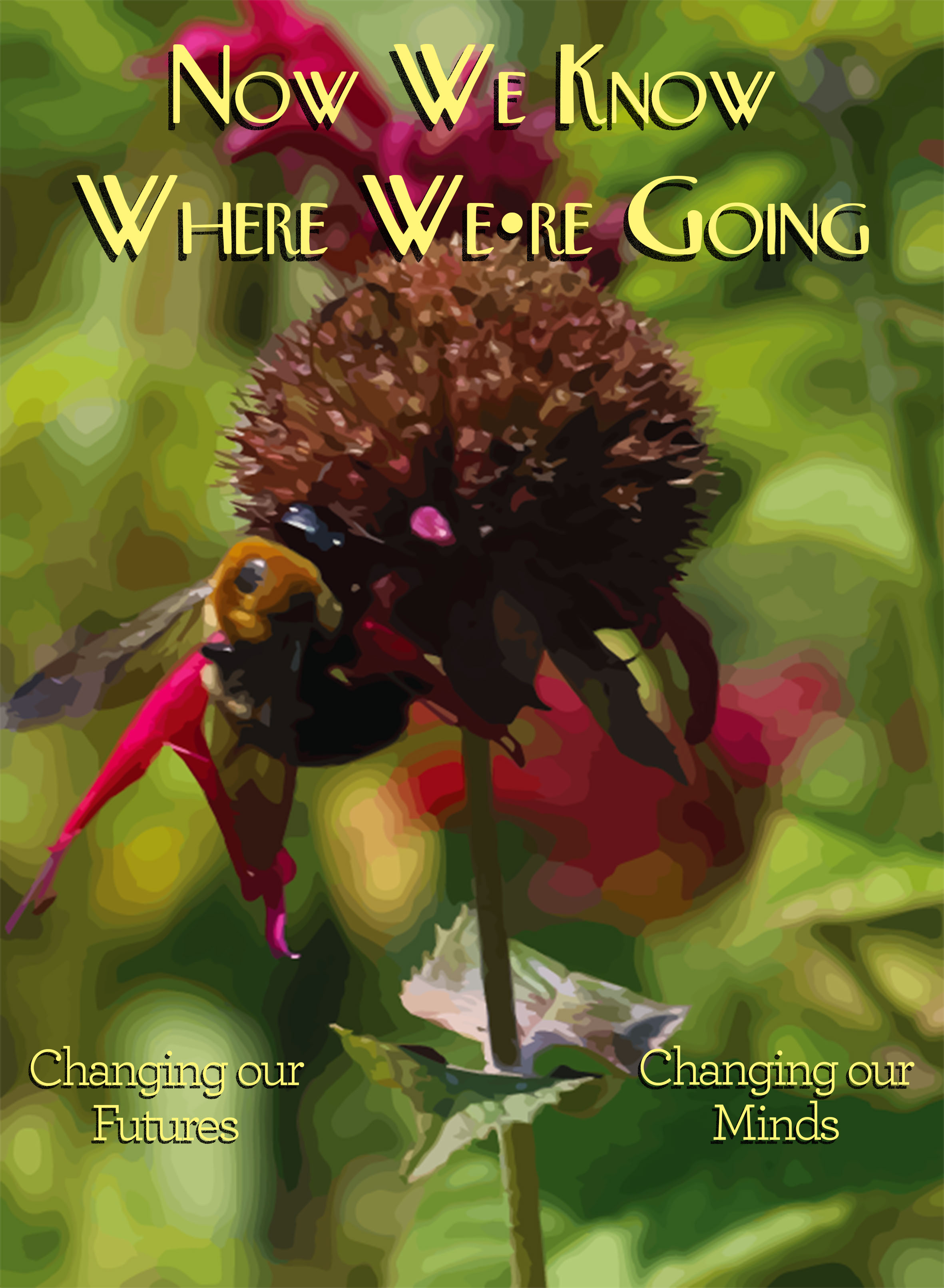
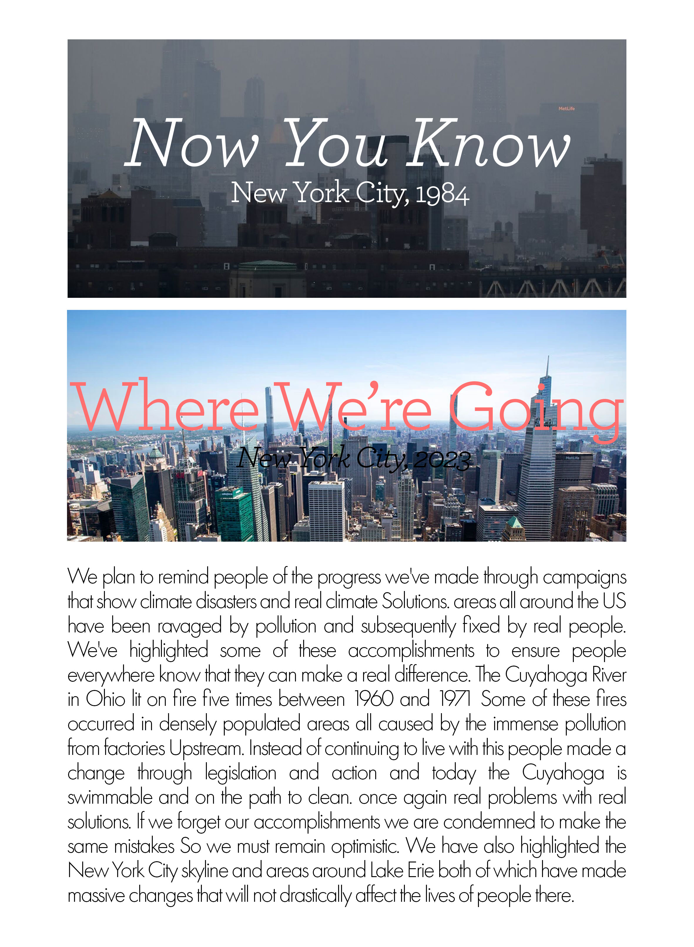
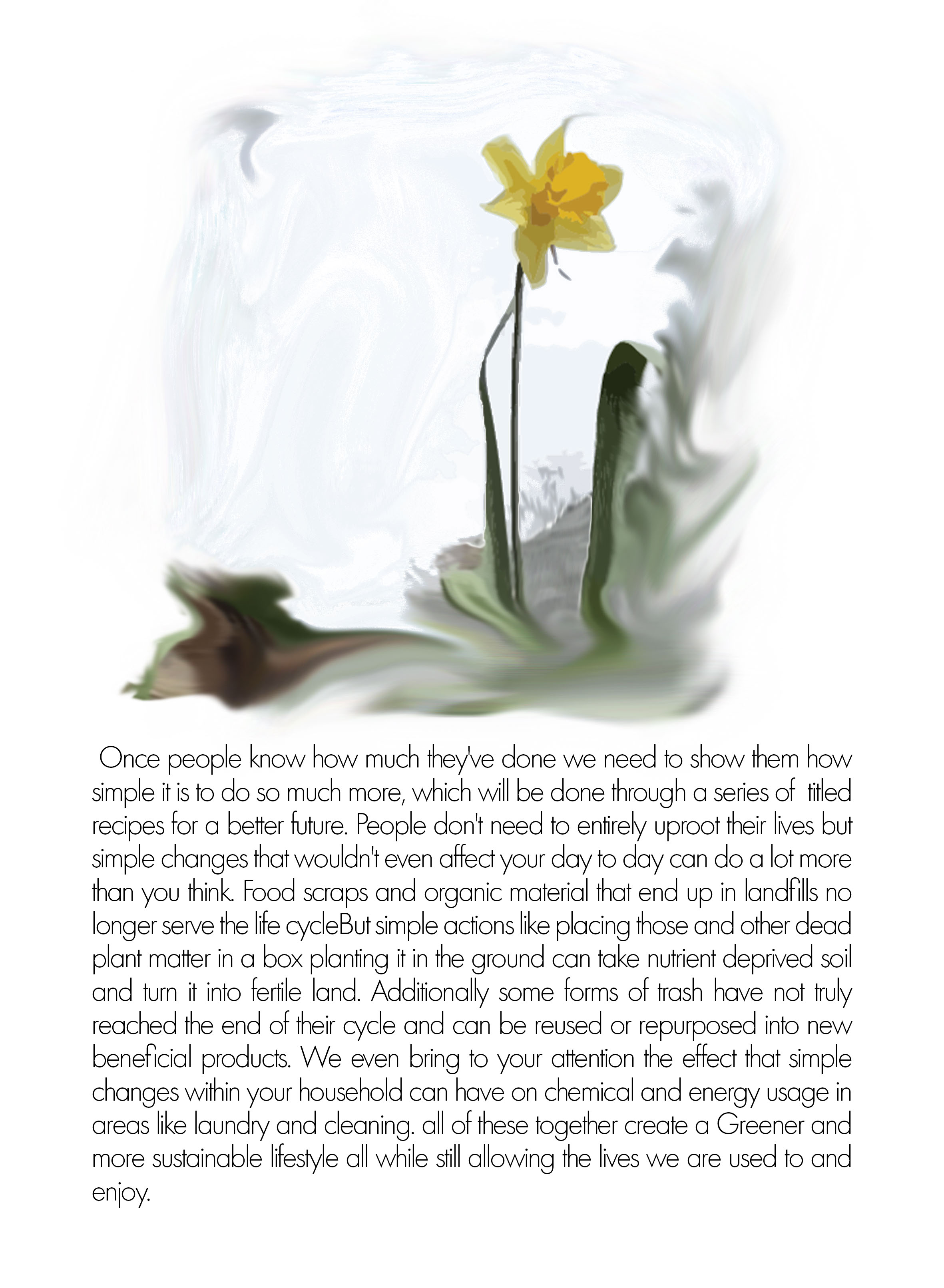
When choosing a design for the posters, I felt that Irving Penn’s work was not suitable for creating a sense of hope. Instead I chose his style of black and white photography to depict the damaged portions of the climate from our past, while juxtaposing it with bright and serene images in full color. As for the style of font and the layouts of the posters and videos I decided to go back to my childhood for inspiration. Fantastic Mr. Fox by Wes Anderson has been my favorite movie since I was 8, so it seemed that taking a graphic design direction from him was most suitable for creating positive feedback through the ad campaign.